Case Study: Cosmos pizza
Cosmos Pizza -
Full Mobile App Redesign
Complete mobile app redesign from user experience,
user flows, app mapping, new user interface and comletely new order and delivery tracking system.
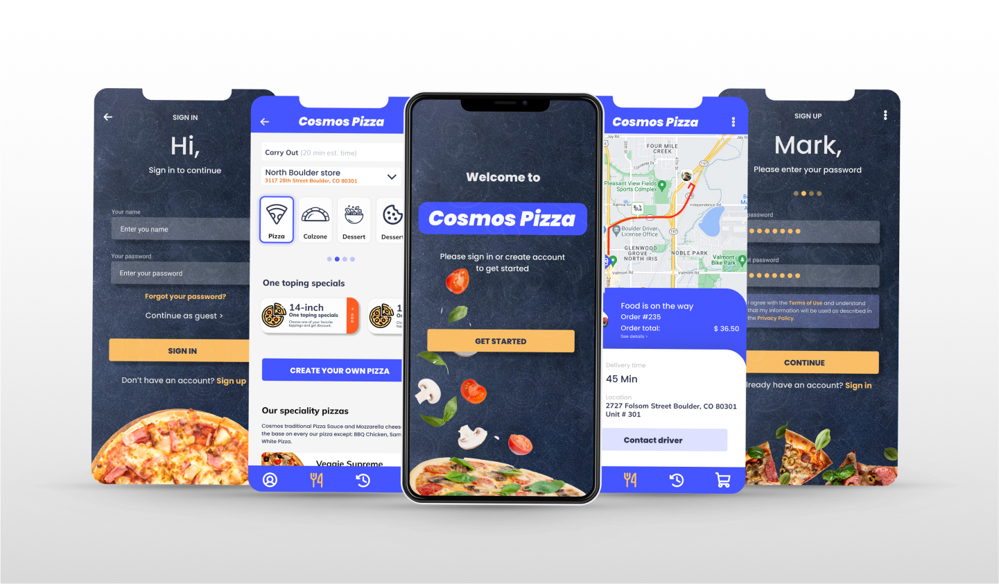
Project Overview
For this project, I was tasked to identify problems within an existing mobile application to design a solution for it and redesign the user interface. The app that I was doing the project on was Colorado famous Cosmos Pizza with six stores around Colorado and tendency to open more. The timeline for this project was 3 weeks.
Timeline, Research, Planing
Before starting on the project, first I had to decide on the tools & technique that I wanted to apply to this project. I also came up with a schedule to keep track of my time.

Evaluation of the app itself. I went through all the interactions and pages of the app, looking for potential problems that are existing in the app.
- Selection buttons were too small to press
- There is no guest check out option, you need to create account.
- Word Banner that has key information isn’t noticeable at first glance (text too small)
- Call To Action Button wasn’t working
- Information of the food items were cut off from the screen
- Customize item button and option too small and confusing (not on right place)
- Cart too confusing and no info about order
- No UI design at all
- No order tracking.
Competitive Analysis & Research. I expanded my competitors to not only pizza and fast food but also to food delivery app to understand how the ordering process was done, what are the practices that can be adopted from competitors to consider for the redesigned app.

User Research & Interviews. I interviewed 2 users who have done fast food app ordering in the last year and have using Cosmos app and 2 employees (General manager and Shift manager) I chose this group in order to understand why users will order on an app and not on through the phone or by using the desktop.
- A few interest findings were also found from the research — (1) All of them ordered for casual meals (not for celebration purpose) and (2) Most of them look at promotions before ordering.
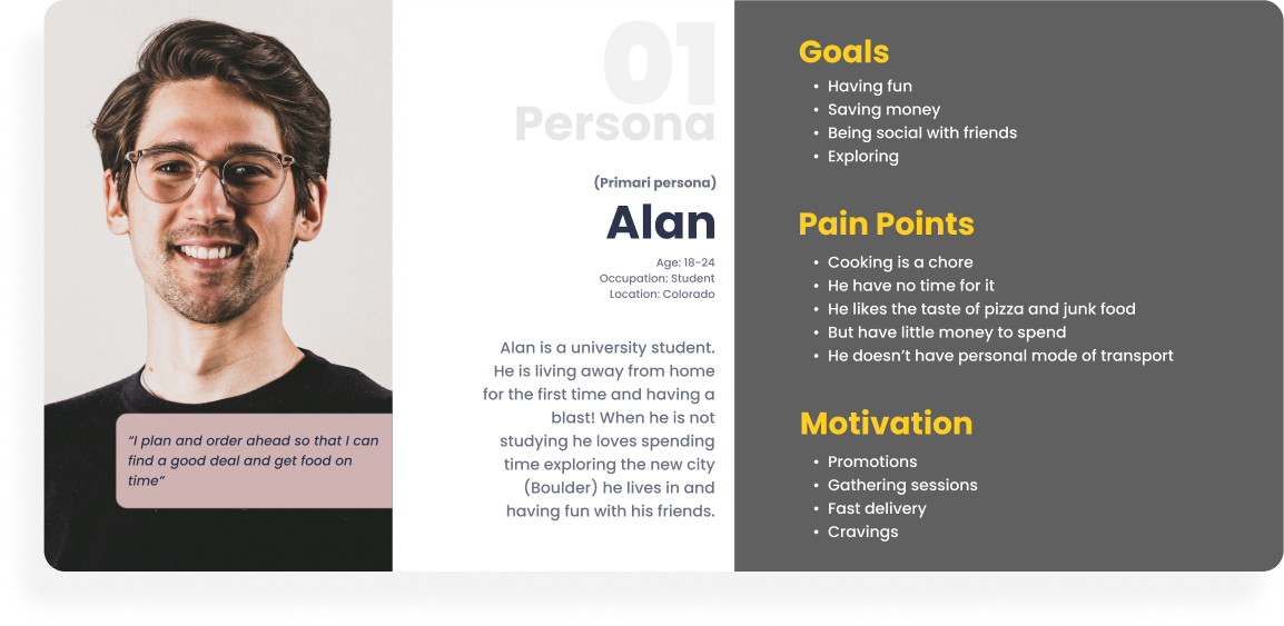
Creating Persona
I created a persona based on the ‘i’ statements. I chose Alan Cox as the main persona as his persona echo with the student vision of providing casual and affordable meals for him and friends.
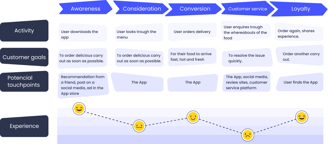
Customer Journey Mapping
The pain points came out the journey mapping of Alan Cox gave us insights on opportunities for improvements. Focusing on the unpleasant emotions, I came up with these opportunities.
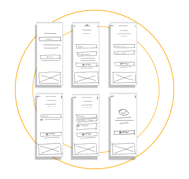
Lo-fi Screens
After several iterations, I tested the wireframe flows informally with friends and family who gave me feedback on the sign up process. While I have worked out to reduce the flows of the signup form from 12 inputs to around 4 inputs. Users still feedback that it was good to have guest checkout without signing up.
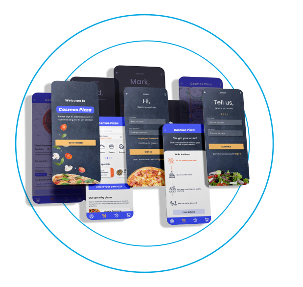
Hi-fi Screens
After several iterations, I tested the wireframe flows informally with friends and family who gave me feedback on the sign up process. While I have worked out to reduce the flows of the signup form from 12 inputs to around 4 inputs. Users still feedback that it was good to have guest checkout without signing up.
Conclusion
Once again, it was a challenging project to push me on accelerated learning to pick up and apply the new concepts (Persona, customer journey mapping etc) of UX quickly, planning in advance to accommodate team dynamics and working as a team to complete the project.
What I Have Learned
An ordering process is not easy! I considered deeply on the delivery address, time, the login process and reworked many times to find optimal placement for each. It was difficult but we learned a lot on the interactions that are more mobile-specific. I also realize that there are many systems available to use for mobile design which I would like to explore next time.
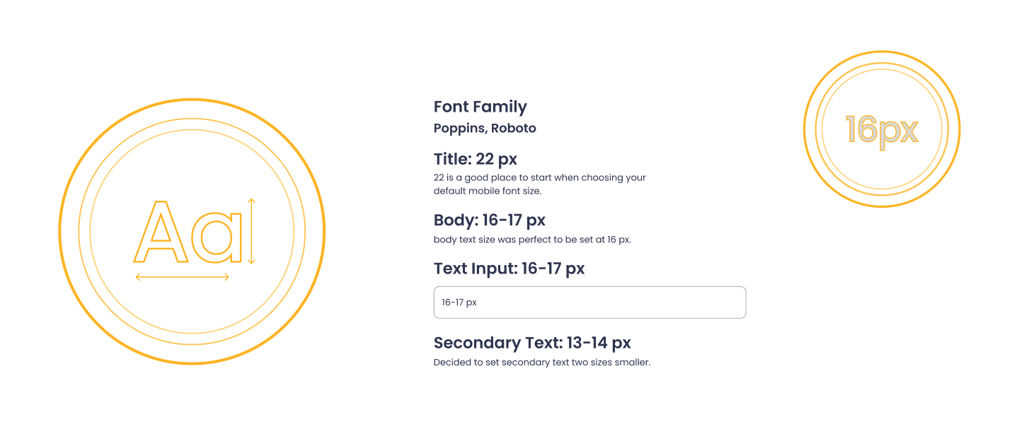
Mobile App Typography
Icons Used
Color Palette
